Mapping North America with QGIS: Tips and Tricks
Recently I’ve bought a book called Maps by Aleksandra Mizielinska and Daniel Mizielinski to my nephew. The book’s absolutely wonderful and made me want to try crafting a map with similar looks. I don’t do maps much at CleverMaps, so this was a great opportunity to find out what new features became available during the last months of QGIS development.
Result
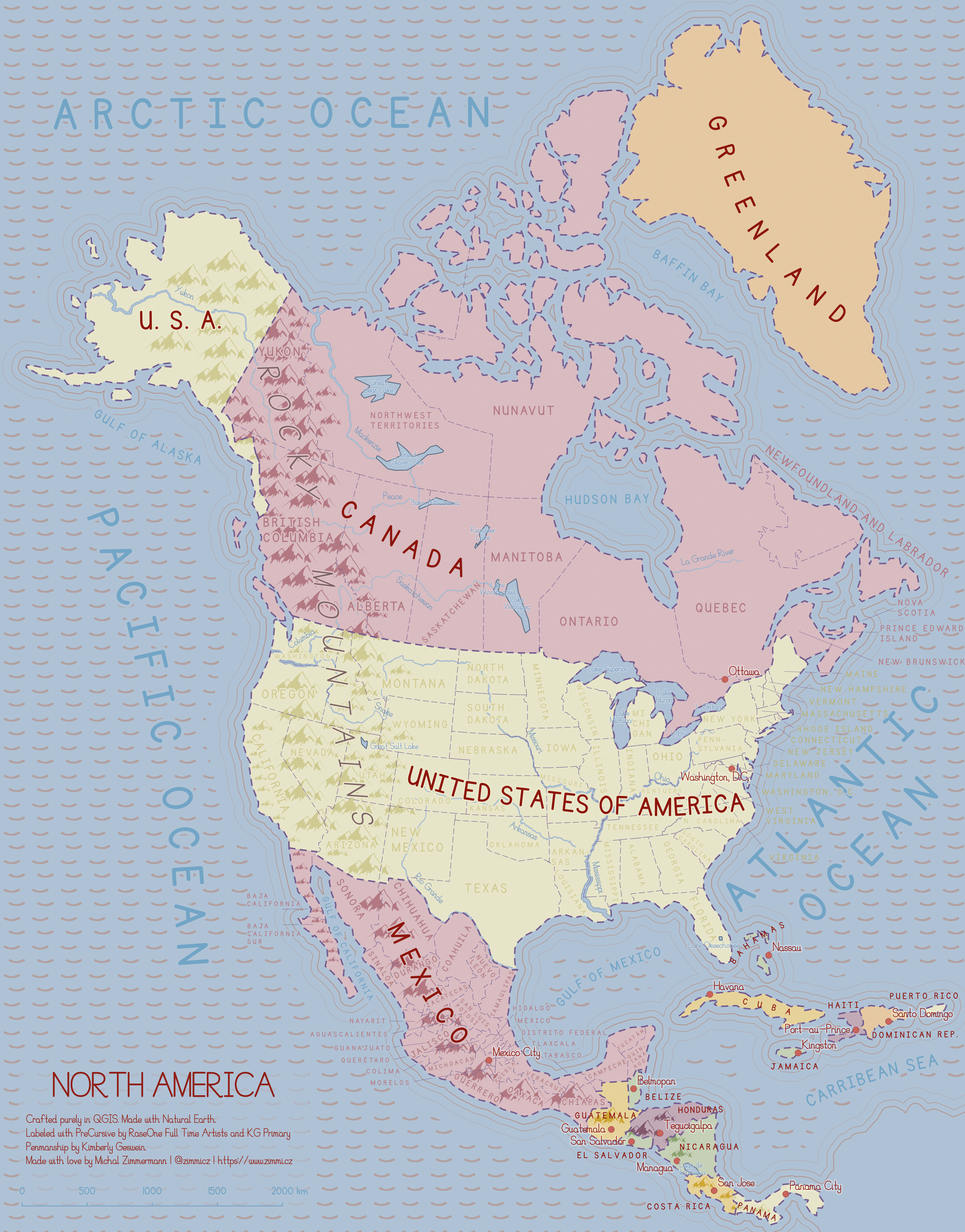
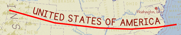
A map of North America in scale of 1:22,000,000 featuring the biggest lakes, rivers, mountain ranges and basic administrative units for the North American countries. I aimed for visually appealing overview map rather than perfectly correct topographic one.
Data
I used my beloved Natural Earth dataset for both cultural (boundaries, cities) and physical (rivers, lakes) map features. Different scales came to play for different map layers as they seemed a bit too/few simplified for the given scale.
Fonts
I usually use built-in system fonts (Ubuntu Condensed or such), but this kind of map needed a more handwritten looking, sort of childish font. After searching dafont.com I chose PreCursive by RaseOne Full Time Artists and KG Primary Penmanship by Kimberly Geswein.
Symbols
The mountain point symbol was one of the two custom symbols used on the map. It comes from BSGStudio. The ocean wave symbol was made by myself.
QGIS effects
I’ve used several techniques I find interesting enough to be listed here.
Coastlines
For a long time I’ve considered coastlines a field for cartographic invention. They can be emphasized by shading or 3D effects. I chose the set of four parallel coastlines subtly disappearing into the sea, hopefully invoking the feeling of waves coming to the shore.
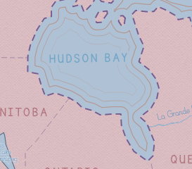
It’s done by dissolving all the features and buffering them again and again.
Buffered labels
Buffered labels are usually hard to get right, because they fill so much space if the buffer color’s not corresponding to its surroundings. But choosing the proper color can be a real struggle at times.
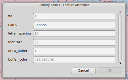
On this map, almost all the labels are buffered with the color of its surroundings, which makes them more legible, yet not too expressive. This is possible thanks to QGIS expression based properties that let you define unique styling to different map features.
Where it isn’t possible (e.g. Bahamas or Honduras) to choose just one buffer color, the label is not buffered at all (or the semi-transparent white buffer is used).
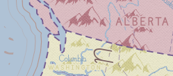
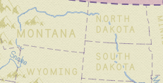
Note the Rocky Mountains label is split on the borders of the U.S.A. and Canada and its both parts match the background color.
Tapered rivers
Rivers are tapered based on the Natural Earth’s width attribute value for each river segment.
Labels in separate layers
I’m used to put labels into separate layers in more complicated map compositions, especially when you need to draw label along path for areal features (such as countries or states).
It becomes a bit harder to keep the features in sync with the labels though. I’d like to use only one layer for all the map layers in the future, as I feel that’s the way to go for the best labeling.
Labels wrapped on character
Some labels just can’t fit the feature they belong to and QGIS lets you deal with this by wrapping labels on a special character, \ in my case.
Layer blending mode
The mechanics behind layer blending modes are still a mystery to me, but they can add that little extra to a map very easily. Thanks to the Overlay blending mode, the Rocky Mountains may remain very subtle on different kinds of background.